CSS Editor
Custom styling is essential for aligning internal tools with your brand image. While component-level CSS has always been possible in Windmill App Editor, CSS can also be defined globally: for an entire app and across all apps as themes.
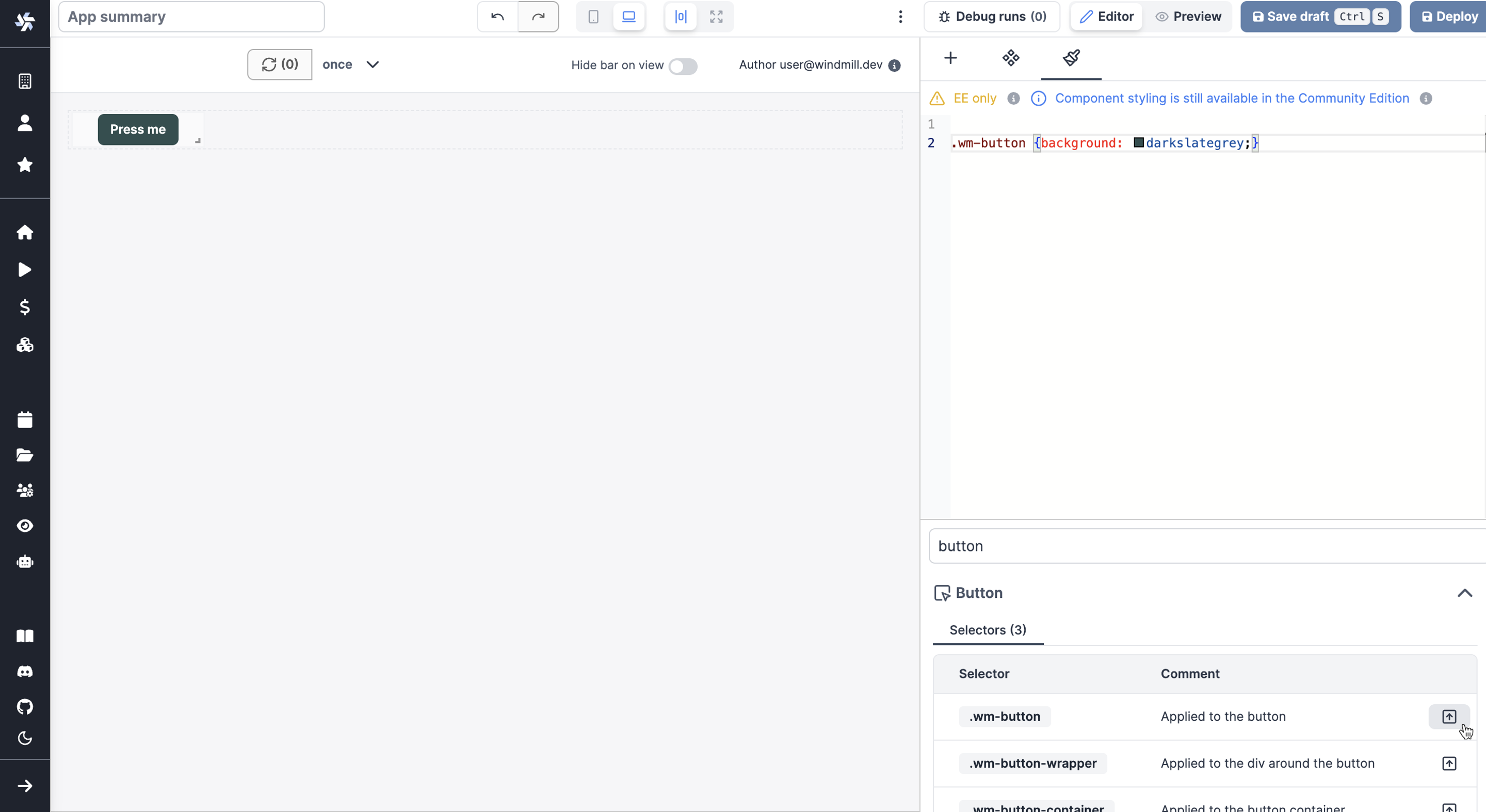
This CSS is editable from a dedicated CSS editor, a centralized location for defining, managing, and applying CSS rules.
With this feature, you can ensure consistent styling and create reusable themes for different teams, projects, clients etc. Not only that, but we also took care of doing an exhaustive hierarchy of classes that correspond to the structure ou our components, enabling to customize any aspect of them.
The Global CSS Editor is a feature exclusive to Cloud & Enterprise Self-Hosted. However, users on the Community Edition can still access and experiment with this tool directly in the editor for evaluation purposes, although these changes will not be reflected in the app preview.
Class Identifiers
For a more granular control, specific classes have been added to each component. These class identifiers make it easier to target and globally style individual components across your app. Here are examples of classes, and are listed in the Helper Block as well:
wm-containerwm-listwm-list-paginationwm-list-pagination-buttonswm-drawerwm-drawer-buttonwm-drawer-button-containerwm-buttonwm-button-wrapperwm-button-container
Class identifiers helpers
In addition to the core features of the Global CSS Editor, the Helper Block is designed to assist you in the styling process. This searchable list of components provides quick access to all the class identifiers and CSS variables associated with each component. It also includes a convenient "Insert" button for each item, allowing you to quickly insert the class or variable into your CSS code.
How to Use the Helper Block
- Search for Components: Use the search bar to quickly find the component you are interested in styling.
- View Class Identifiers and Variables: Once you select a component, a list of its specific classes and modifiable CSS variables will be displayed.
- Insert to Code: Next to each class and variable, there is an "Insert" button. Clicking this will automatically insert the relevant item into the code editor.

Themes
Themes are saved configurations of your global CSS. They allow you to define the appearance of all the desired components with a single click.
To create a theme, fork another theme (by default, the default theme).
Then make your modifications and either update another theme or create a dedicated theme.
You can preview each theme with 'Preview' and then choose one with 'Apply'.
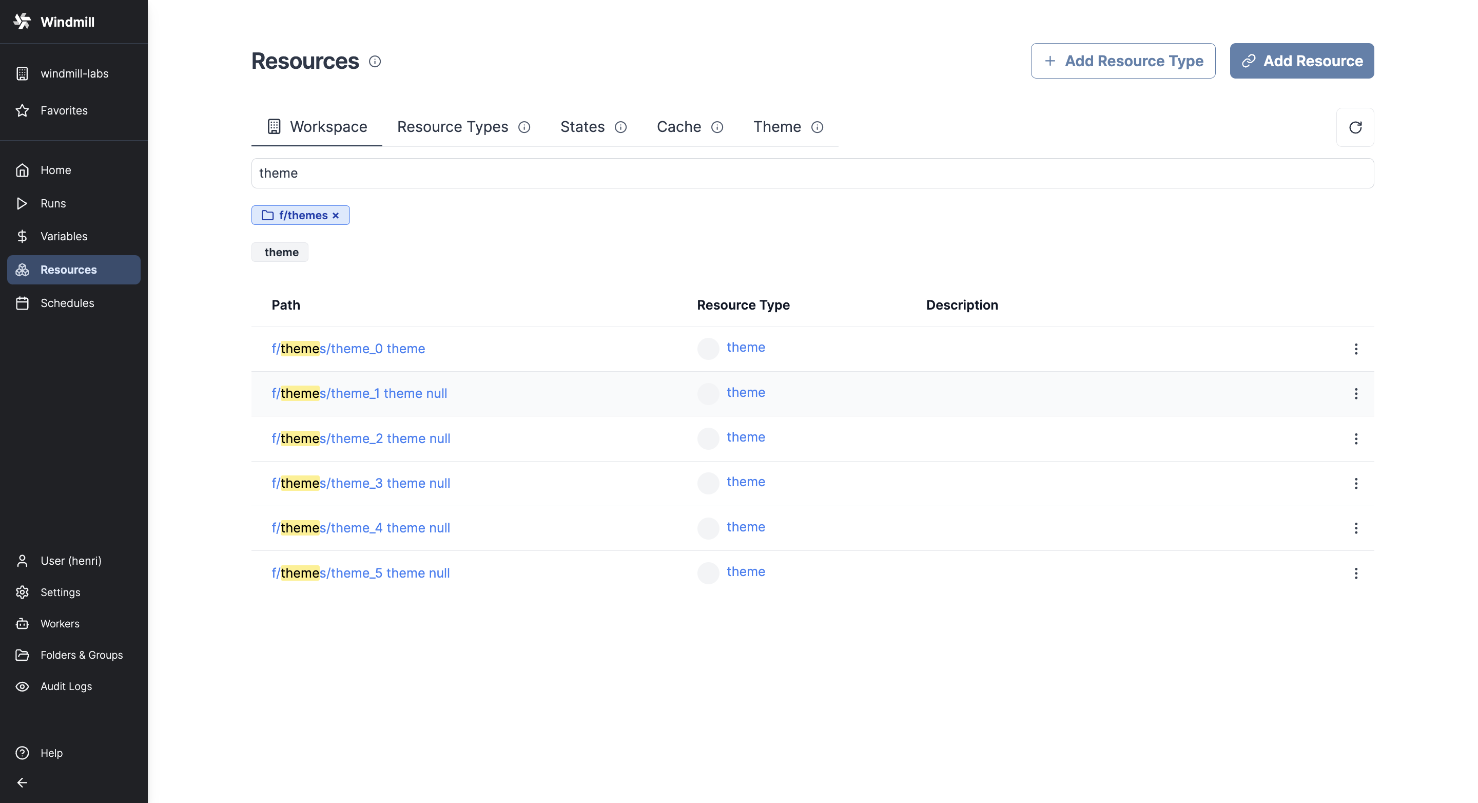
All workspace themes can be found with Resource Type theme, in Folder themes.

Migrating Component-Level Styles to Global CSS
In the Cloud & Enterprise Self-Hosted of the Global CSS Editor, you can migrate component-level styles to the global level, streamlining the process of achieving consistent design across your application. This feature allows for two types of component-level styles to be migrated:
-
Navigate to the component whose styles you wish to migrate. Select the option to 'Move to CSS editor', which will open a modal window.
-
In the modal, you will see a list of all the CSS rules that can be moved to the global level. These are the styles you've previously set either for a specific component or for every component of a particular kind.
-
You can preview the css rules that will be migrated. If the class already exists in the global CSS, the rule will be appended to the existing class. If the class does not exist, it will be created.
-
Once you are satisfied with the changes, click the 'Migrate' button. This will move the styles to the global level and remove them from the component-level.